Is Industry 4.0 working?

Figure 1: U.S. Manufacturing Labor Productivity
I talk about Industry 4.0 a lot. Probably too much, depending on who you ask. 😇
I write about smart manufacturing, digital transformation, automation, industrial AI, connected operations, and manufacturing strategy constantly. I speak about these topics at conferences around the world. I interview manufacturers. I sit on industry boards. I spend a fairly ridiculous amount of my free time reading manufacturing research that normal people would almost certainly not consider recreational reading.
So I have spent years making the case that manufacturing is changing, and that the technologies we loosely group under the Industry 4.0 label are part of that change. And that is why one particular chart (Figure 1) has bothered me for a long time. I have now seen some version of it presented at least a dozen times at conferences, presentations, panels, and industry discussions. Usually, someone puts it on the screen and lets it sit there for a second.
It is a FRED chart showing U.S. manufacturing labor productivity. And it looks terrible.
The line rises impressively through much of the 1990s and early 2000s. Then, right around the period when Industry 4.0 was supposed to be getting started, it basically stops. It doesn’t just slow down a little, it completely stops. Depending on exactly where you draw the starting line, U.S. manufacturing labor productivity today is roughly where it was more than a decade ago. The implication is usually obvious even when the presenter does not say it directly:
We have spent the last decade talking about smart factories, connected machines, advanced analytics, robotics, cloud computing, digital twins, machine vision, artificial intelligence, and industrial transformation. So where is the productivity?
The source makes the argument even harder to dismiss. This is not a technology vendor surveying its best customers. It is not a consulting firm publishing a maturity study based on a few hundred executives. It is not a case study about one unusually successful factory in Germany or Singapore. The data displayed by FRED come from the U.S. Bureau of Labor Statistics, one of the primary statistical agencies responsible for measuring the American economy. When someone puts that chart on a conference screen, there is an immediate credibility to it. The implied argument is usually obvious: Industry 4.0 promised productivity, manufacturing productivity stalled, therefore Industry 4.0 has failed.
Over the years, I have read countless studies, talked with manufacturers, visited plants, interviewed industry leaders, and seen plenty of evidence of improvements in quality, throughput, safety, maintenance, energy use, flexibility, and other areas. But I realized something slightly uncomfortable. Almost none of that research was directly answering the question the chart seemed to raise. I had accumulated a lot of evidence that individual manufacturers and individual technologies could produce value, but I had never really stepped back and asked whether manufacturing as a whole had gotten measurably better during the Industry 4.0 era. So I decided to dig into it. I started with the FRED chart itself, including what “productivity” actually means in this context and how the number is calculated. Then I went looking beyond productivity at other measures of actual manufacturing performance. I deliberately avoided technology adoption rates, spending forecasts, robot installations, and the usual digital transformation surveys about what companies plan to do. I wanted outcomes. Is manufacturing producing more value? Is it safer? Is it using resources more efficiently? Are plants actually seeing measurable improvements from these technologies? And, if they are, why has so little of that improvement appeared in aggregate productivity?
This article is my attempt to work through that evidence and answer a question I probably should have investigated more directly years ago: Is Industry 4.0 actually working? My conclusion is not a simple yes or no. The FRED chart is not wrong, and I think the productivity problem deserves far more attention than the Industry 4.0 community sometimes gives it. But I also think using that chart alone to judge the last decade of manufacturing gives us a very incomplete picture of what has actually changed.
What Is Industry 4.0 Anyway?
Industry 4.0 originated in Germany around 2011 as part of a national effort to think about the future of manufacturing, particularly what would happen as automation, software, connectivity, data, and physical production became increasingly intertwined.

Figure 2: The Four Industrial Revolutions
The idea spread quickly, although the terminology changed depending on where you went. In the United States we talked about smart manufacturing, the Industrial Internet, connected factories, and digital transformation. Other countries created their own programs and frameworks. Somewhere along the way, Industry 4.0 became both a description of a technological shift and, for some people, a destination. That second interpretation has always bothered me a little because future utopian states have an annoying habit of never arriving. I cannot count how many times someone has told me, “But my company isn't even at Industry 3.0 yet.” My response is usually, “Your company still exists in 2026, right? Then congratulations, you survived the Third Industrial Revolution.” You may not have implemented every technology associated with it, and you certainly did not reach some perfect end state, because nobody did. There is no factory we can point to from 2005 and say, “That one finished Industry 3.0. They got 100%.”
I think Industry 4.0 is much more useful when we treat it as a description of the industrial era we are living through rather than a maturity level that individual companies eventually complete. It encompasses changes in technological capability, economics, customer expectations, buying behavior, labor, business models, supply chains, product complexity, software, data, automation, and even the way changes in B2C markets eventually reshape expectations in B2B. Individual companies will participate unevenly. Some will lead, some will follow, and some will continue operating surprisingly old equipment very profitably. That does not mean the broader industrial system is not changing. If we can look at manufacturing today and reasonably say, “This industry works differently than it did twenty years ago,” then something significant happened regardless of whether every factory checked every box on an Industry 4.0 maturity model. That is the definition I am using for the rest of this article. I am not asking whether every manufacturer has reached some theoretical Industry 4.0 destination. I am asking whether the collection of changes we have associated with Industry 4.0 has made manufacturing, as an industry, measurably better.
What the FRED Chart Actually Measures
Before arguing with the chart, I wanted to understand what it actually was. FRED, or Federal Reserve Economic Data, is maintained by the Federal Reserve Bank of St. Louis and makes thousands of economic datasets easy to find and graph. But FRED is not calculating the manufacturing productivity number itself. The series most often shown, OPHMFG: Manufacturing Sector Labor Productivity, comes from the U.S. Bureau of Labor Statistics.
The purpose of the measure is straightforward. Economists want to understand whether an industry is producing more simply because it is using more labor, or because it is producing more with each hour of labor. In manufacturing, BLS defines labor productivity as:
Manufacturing labor productivity = real manufacturing sectoral output ÷ total hours worked
If output grows faster than hours, productivity rises. If they grow at roughly the same rate, productivity is flat. That sounds simple, but once I dug into the BLS methodology, I realized both sides of the equation require quite a bit of construction.
The output side is not a count of cars, pharmaceuticals, semiconductors, chemicals, and refrigerators somehow mashed into one number. BLS constructs real sectoral output using current-dollar manufacturing data, adjusts for price changes, removes transactions occurring within manufacturing to avoid double counting, and uses additional Federal Reserve data and statistical benchmarking to create the quarterly series.
The labor side is assembled from several sources as well. Employment and hours data come largely from Current Employment Statistics, with additional information used to account for supervisory workers, the self-employed, and other categories. BLS also adjusts paid hours into hours actually worked because vacation, holidays, and sick leave should not count as production time.

Figure 2: The technical construction process. Some labels are abbreviated, but the important point is that both output and hours are assembled from several sources and adjustments before becoming the final OPHMFG output-per-hour measure.
Going through this actually made me trust the statistic more, not less. But it also clarified what question it answers: How much inflation-adjusted manufacturing sectoral output are we producing for every hour of labor used?
That is an important measure, and I do not think Industry 4.0 advocates should explain away the disappointing result. If these technologies are creating substantial economic gains, some of those gains should eventually show up in productivity. But the measure is still only one view of manufacturing performance. It does not separately tell us whether factories became safer, less wasteful, more energy efficient, more reliable, better at quality, or better at handling greater product complexity.
The Macroeconomic Verdict Is Still Poor
Understanding how the productivity measure is built did not make the result any easier to explain away. If anything, digging into the underlying BLS series made me a little more uncomfortable with it. Using the quarterly real manufacturing sectoral output and all-person hours worked data, I calculated that average real sectoral output declined about 3.4% from 2014 to 2024, while hours worked increased about 1.6%. Put those together and manufacturing output per hour fell roughly 4.9%.

Figure 3: Real manufacturing sectoral output, all-person hours worked, and output per hour, rebased to the 2014 average. Source: U.S. Bureau of Labor Statistics via FRED.
That was an important reality check for me. This is not some quirky denominator problem where labor hours exploded while factories quietly produced far more than anyone noticed. On the BLS measure, real sectoral output itself was lower. I would love to find a clever statistical explanation that makes that go away because, frankly, it would make the rest of this argument much easier. I cannot.
I also wondered whether labor productivity was simply too narrow. Manufacturing obviously uses much more than labor, so I checked BLS total factor productivity for manufacturing, which incorporates a broader set of inputs. Unfortunately, that does not rescue the story either. The manufacturing TFP index fell from 102.118 in 2014 to 99.326 in 2024, about a 2.7% decline. A BLS analysis of manufacturing multifactor productivity found a similar longer-term pattern: productivity grew about 2.0% annually from 1992 to 2004, then declined 0.3% annually from 2004 to 2016.
There are some signs of improvement more recently, which is encouraging, although I am hesitant to declare victory after a few good quarters. A 2026 BLS analysis found stronger productivity growth during parts of 2025, but manufacturing labor productivity still grew only about 0.4% annually from late 2019 through Q3 2025, compared with a long-run rate of roughly 2.1%.
So what does this make me think? If Industry 4.0 was supposed to create a broad increase in U.S. manufacturing productivity, the macroeconomic record is poor. I do not think we should hide from that or dismiss FRED because the answer is inconvenient. The harder and more interesting question is whether weak aggregate productivity means manufacturing failed to improve overall, or whether we have been asking one very important statistic to tell us much more than it actually can.
One Ratio Cannot Describe the Whole Industrial System
Labor productivity is selective by design. An improvement shows up when measured real output rises, labor hours fall, or both. That means a plant can improve traceability, catch defects earlier, prevent a recall, reduce emergency downtime, or run smaller batches with more variants without producing a dramatic change in the national ratio. Some of those gains should eventually show up in output or cost, of course, but they are not separately scored inside OPHMFG.

Figure 4: Simplified manufacturing labor productivity measurement pipeline. Synthesis based on BLS methodology. Quality is not wholly omitted because BLS price indexes use quality adjustments, but many operating outcomes are not direct components of the ratio.
Quality is a good example of where I had to be careful. BLS does use quality-adjustment methods in its price indexes, so saying “the government ignores quality” would be wrong. The trickier issue is that modern manufacturing often spends part of its technical gain on tighter tolerances, more variants, more documentation, faster changeovers, embedded software, or customer-specific requirements. A factory can get much better at carrying complexity while its measured output per hour moves only a little.
Somewhere in this research I caught myself thinking about dishwashers, which is admittedly not where a serious productivity paper is supposed to end up. A better dishwasher does not make a household “produce” more plates; it gives time back, then somehow the household responds by cooking more elaborate meals and dirtying more pans. Manufacturing is obviously not my kitchen, but the thought stuck with me. Efficiency gains are often spent on a higher operating standard rather than on simply making the same thing with fewer hours.
I would not use that as an escape hatch forever. If the gains are large and widespread, some of them should eventually appear in labor productivity, total factor productivity, costs, margins, or output. “The benefits are invisible” is impossible to falsify and therefore not a very satisfying defense. My point is narrower: a flat productivity ratio can coexist with meaningful improvement elsewhere, so I wanted to see whether those other improvements were actually there.
U.S. manufacturing did improve on several actual outcomes
This is where the picture gets more interesting. I deliberately stayed away from the usual evidence that manufacturers bought more software or installed more robots. Instead I looked for changes in actual outcomes: economic value, injuries, environmental releases, and energy use. None of these can be cleanly assigned to Industry 4.0, and I would be suspicious of anyone who tried, but they do tell us whether the industrial system was simply standing still.

Figure 5: Example Improvements in US Manufacturing
Let’s look at a few examples:
Real manufacturing value added increased from an average of about $2.05 trillion in 2014 to about $2.36 trillion in 2024, in chained 2017 dollars, roughly a 15%increase according to BEA data distributed through FRED. That is not the same output concept used in OPHMFG, so it does not cancel the productivity decline. It does mean manufacturing was contributing more real economic value to GDP.
Safety moved in a better direction too. The employer-reported recordable injury and illness rate in manufacturing fell from 4.0 cases per 100 full-time-equivalent workers in 2014 to 2.7 in 2024, a reduction of about one-third. I would never assign all of that to automation or digital systems; regulation, training, plant mix, protective equipment, and management practice matter enormously. Still, a machine interlock or vision system that prevents someone from getting hurt has real value even if it does not increase the number of units shipped that afternoon.
The environmental numbers have a similar caveat and a similar direction. EPA Toxics Release Inventory data show manufacturing releases of covered chemicals fell by 226 million pounds, or 15%, from 2014 to 2023 while manufacturing value added rose. And EIA manufacturing energy data show total energy consumption rose 6% from 2018 to 2022 while manufacturing gross output rose about 19%, implying a meaningful reduction in energy used per unit of gross output. Product mix and regulation are part of those stories. Better process control, maintenance, automation, and monitoring can be part of them too.
Of course these numbers do not prove that Industry 4.0 caused the improvement, which is important to state upfront. They do, however, show that “manufacturing did not get better” is too broad a conclusion to draw from one productivity chart. The industry became larger in real value and improved on several outcomes that operators, employees, regulators, and customers actually care about.
Plant-Level Evidence is Considerably Better
When I move from national aggregates down to plants and firms, the evidence gets much more favorable, although also much messier. The samples are different, the methods are different, and the best-known examples are almost certainly better than the average plant. I still think the results matter because they answer a different question: can these technologies create measurable operating value when they are implemented well?

Figure 6: Reported Operational Results From Smart Manufacturing Programs
In Deloitte’s 2025 Smart Manufacturing and Operations Survey of 600 executives at large manufacturers with U.S. headquarters or operations, respondents reported average net improvements of 10 to 20% in production output, 7 to 20% in employee productivity, and 10 to 15% in unlocked capacity after implementation. Those are self-reported numbers, not audited national statistics, so I give them less weight than BLS. I also do not think 600 executives collectively hallucinated all of the operating improvement.
The World Economic Forum’s 2025 Global Lighthouse cohort is even more dramatic: the selected sites reported an average 53% increase in labor productivity and a 26% reduction in conversion cost, while value chains reported roughly 50% shorter new-product introduction times, 30% lower material waste, and 25% lower energy and water consumption. These plants are selected precisely because they are exceptional, so treating those numbers as a manufacturing average would be ridiculous. But exceptional sites are still useful evidence that the methods can work. The 2026 cohort keeps producing similar examples; one newly recognized digitally enabled pharmaceutical facility reported 50% faster speed-to-patient and 67% higher laboratory labor productivity.
The academic evidence is less spectacular and, to me, more reassuring because of that. A peer-reviewed study of Italian manufacturing micro, small, and medium-sized firms estimated that first-time Industry 4.0 adoption increased labor productivity by more than 7% on average. U.S. Census research covering more than 300,000 firms found that businesses using advanced automation technologies had labor productivity about 11.4% higher than other firms. The Census estimate is an association, not a clean causal effect, because better firms may be more likely to adopt the technology in the first place.
I found another 2025 survey especially useful because it sits somewhere between the polished case study and the government aggregate. In the Manufacturing Leadership Council’s survey on manufacturing data, 75% of respondents reported a medium or high impact on productivity from manufacturing data since beginning their digital journey, 77% said the same for efficiency, 74% for quality, and 72% for cost reduction. 93% said data had improved manufacturing decision-making. Self-reported again, yes, but the pattern is hard to square with the idea that digital manufacturing has created no value at all.
That is about as far as I am comfortable going. I think there is enough plant-level and firm-level evidence to reject the claim that Industry 4.0 technologies do nothing economically useful. I do not think there is enough evidence to say the average U.S. manufacturer has captured those gains consistently, and that gap between “can work” and “usually works” is probably the most important part of the story.
Most Companies Have Not Produced The Best Results
The broad survey evidence gets less flattering once we stop looking at selected success stories. In PwC’s 2024 Digital Trends in Operations survey, only 32% of industrial-products respondents said their operations technology investments had delivered the expected results. Integration complexity, people capabilities, program leadership, technology performance, vendor capabilities, and data issues all ranked above the business case as reasons for underperformance. That feels painfully familiar if you have spent much time around large industrial programs.
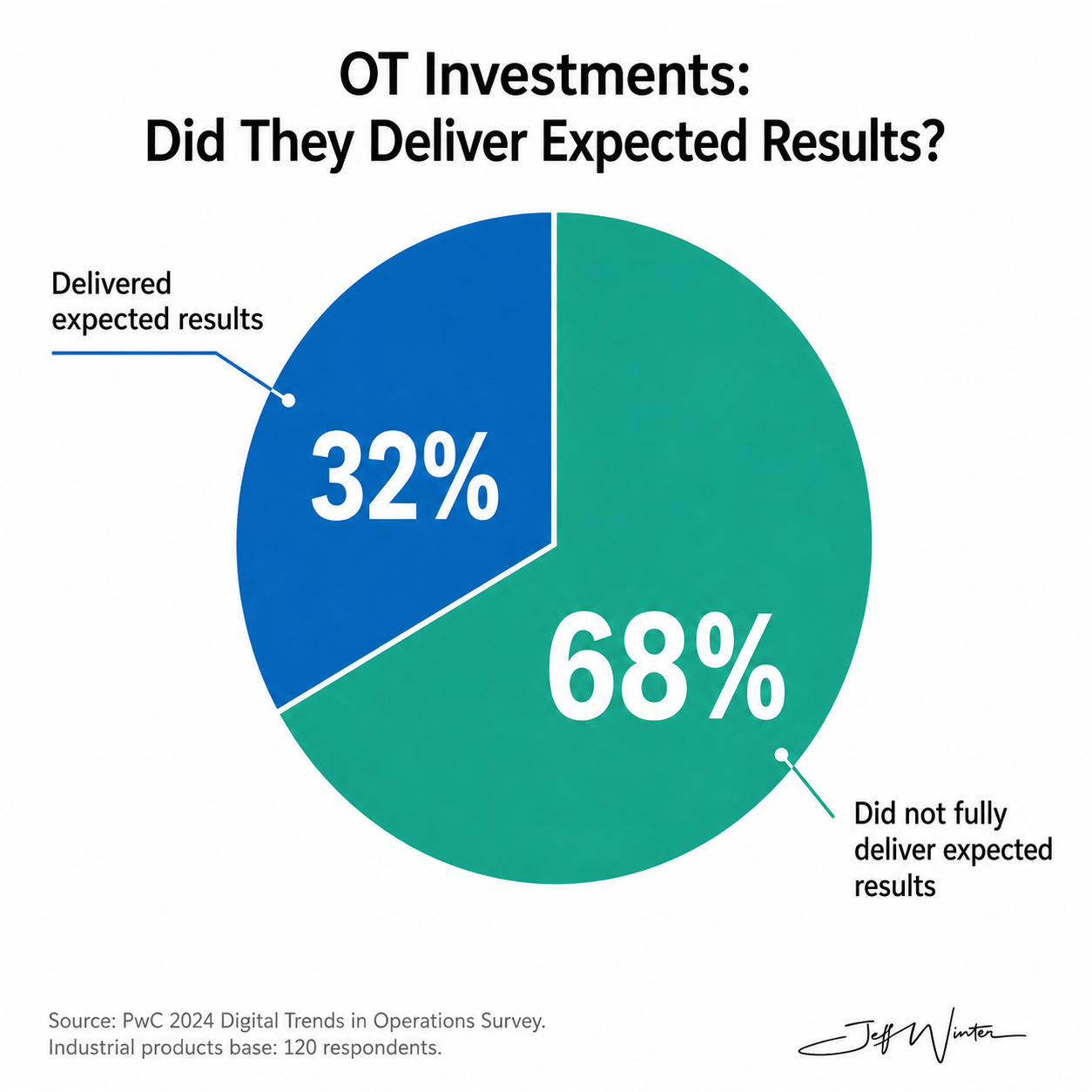
Figure 7: Share of Manufacturers Reporting Expected Results from Operational Technology
The MLC data add some texture to that problem. 46% of respondents said they lacked a corporate-wide data governance plan, only 39% said they had a process to verify the accuracy and quality of manufacturing data, and 79% still relied on manually entered data somewhere in the manufacturing data stream. And, because apparently no industrial transformation is powerful enough to dislodge a spreadsheet, 78% said they use Microsoft Excel for manufacturing data analytics. Excel remains undefeated.
A 2025 U.S. Census working paper on industrial AI offers a more economic explanation for why the aggregate results can lag. The researchers found causal evidence of a J-shaped return pattern: short-run productivity and profitability losses preceded longer-run gains. AI adoption increased work-in-process inventory, robot investment, and labor shedding during the adjustment period, while earlier adopters showed stronger growth over time. Among older establishments, abandoning structured production-management practices explained roughly 1/3 of the early losses.
That sounds much closer to how these programs actually feel inside a plant. For a while, people maintain the old and new systems, 2 databases disagree, the prediction model creates more work orders than maintenance can actually close, and somebody exports everything to Excel because it is the only place the numbers can be reconciled before the 8:00 a.m. meeting. Those are not exotic technology failures. They are normal organizational costs, and they can consume a surprising amount of the value the technology was supposed to create.
Still, the J-curve cannot become a permanent excuse. A J-curve has to bend upward eventually. 10 or 15 years into this industrial era, I think it is reasonable to expect stronger aggregate evidence than we have. The problem is no longer whether the technologies can produce value; it is whether manufacturers can redesign the work around them well enough, and often enough, for that value to survive at scale.
My Verdict: Partial Success, Not Sector-Wide Success
I still land in roughly the same place: Industry 4.0 is working, but not nearly as broadly or as visibly as I would have expected 10 or 15 years ago. The plant-level evidence is too strong to dismiss. There are real improvements in throughput, labor productivity, waste, quality, energy, safety, and responsiveness. At the same time, the national productivity record is too weak to wave away. Both things are true, and I think that tension is actually the most interesting part of the story.
What I still cannot find a satisfying answer to is where the missing productivity went. How much value has been absorbed by greater product complexity, tighter quality requirements, more regulation, cybersecurity, traceability, shorter product lifecycles, and the basic difficulty of running modern manufacturing? How much of the benefit has shown up as avoided downtime, avoided recalls, safer work, lower inventory, or resilience rather than more output per hour? And maybe the harder question: how much of the technology simply never produced the return we thought it would? I can find plenty of evidence for each explanation individually. I cannot find a study that convincingly tells me their relative weight across the industry.
I also want to know why the gap between the best plants and the average plant remains so large. Is it technology? Management? Data quality? Workforce capability? Capital constraints? The ability to redesign work instead of digitizing an old process and calling it transformation? My suspicion is that the answer is messier than the technology industry would like. We love a clean causal story. Manufacturing rarely gives us one.
My hope for the next 15 years is that we get much better at measuring this. I want fewer arguments about adoption and more evidence about outcomes. I want productivity gains that are visible not only inside a few exceptional plants, but in the national statistics. I want safety, quality, energy, flexibility, resilience, and labor productivity measured together instead of pretending one metric can represent the whole system. And I hope we stop treating Industry 4.0 as something manufacturers are supposed to “finish.” By 2040, I would rather look back and say manufacturing became materially better, safer, more capable, and more productive than spend another decade debating whether we finally reached some imaginary end state.
References:
Federal Reserve Bank of St. Louis. (n.d.). FRED economic data. Retrieved August 19, 2026, from https://fred.stlouisfed.org/
U.S. Bureau of Labor Statistics. (2020, September 23). Productivity measures: Business sector and major subsectors: History. Handbook of Methods. https://www.bls.gov/opub/hom/msp/history.htm
U.S. Bureau of Labor Statistics. (2023, March 2). Overview of BLS productivity statistics. https://www.bls.gov/bls/productivity.htm
U.S. Bureau of Labor Statistics. (2025, September 30). Office of Productivity and Technology: Calculation. Handbook of Methods. https://www.bls.gov/opub/hom/opt/calculation.htm
U.S. Bureau of Labor Statistics. (n.d.). Manufacturing sector: Labor productivity (output per hour) for all workers (OPHMFG) [Data set]. FRED, Federal Reserve Bank of St. Louis. Retrieved August 19, 2026, from https://fred.stlouisfed.org/series/OPHMFG
Brill, M., Chansky, B., & Kim, J. (2018, July). Multifactor productivity slowdown in U.S. manufacturing. Monthly Labor Review. U.S. Bureau of Labor Statistics. https://www.bls.gov/opub/mlr/2018/article/multifactor-productivity-slowdown-in-us-manufacturing.htm
Janocha Redmond, J. (2026, March). Is manufacturing productivity recovering? Evidence from the past and present. Monthly Labor Review. U.S. Bureau of Labor Statistics. https://www.bls.gov/opub/mlr/2026/article/is-manufacturing-productivity-recovering-evidence-from-the-past-and-present.htm
U.S. Bureau of Labor Statistics. (n.d.). Manufacturing sector: Hours worked for all workers (HOAMS) [Data set]. FRED, Federal Reserve Bank of St. Louis. Retrieved August 19, 2026, from https://fred.stlouisfed.org/series/HOAMS
U.S. Bureau of Labor Statistics. (n.d.). Manufacturing sector: Real sectoral output for all workers (OUTMS) [Data set]. FRED, Federal Reserve Bank of St. Louis. Retrieved August 19, 2026, from https://fred.stlouisfed.org/series/OUTMS
U.S. Bureau of Labor Statistics. (n.d.). Manufacturing sector: Total factor productivity (MFGPROD) [Data set]. FRED, Federal Reserve Bank of St. Louis. Retrieved August 19, 2026, from https://fred.stlouisfed.org/series/MFGPROD
U.S. Bureau of Labor Statistics. (n.d.). Manufacturing sector productivity: Calculation. Handbook of Methods. https://www.bls.gov/opub/hom/msp/calculation.htm
U.S. Bureau of Labor Statistics. (n.d.). Overview of BLS productivity statistics. https://www.bls.gov/bls/productivity.htm
U.S. Bureau of Labor Statistics. (n.d.). Producer Price Index quality adjustment. https://www.bls.gov/ppi/quality-adjustment/
U.S. Energy Information Administration. (2025). 2022 Manufacturing Energy Consumption Survey: Highlights from data releases 1 & 2. https://www.eia.gov/consumption/manufacturing/data/2022/pdf/MECS%202022%20Release%201-2%20Results.pdf
U.S. Environmental Protection Agency. (n.d.). Manufacturing waste management trend. Toxics Release Inventory National Analysis. https://www.epa.gov/trinationalanalysis/manufacturing-waste-management-trend
World Economic Forum. (2025, January 14). Global Lighthouse Network 2025: World Economic Forum recognizes companies transforming manufacturing through innovation. https://www.weforum.org/press/2025/01/global-lighthouse-network-2025-world-economic-forum-recognizes-companies-transforming-manufacturing-through-innovation/
World Economic Forum. (2026, June 22). New Global Lighthouse sites demonstrate how AI is rewiring manufacturing and supply chains. https://www.weforum.org/press/2026/06/new-global-lighthouse-sites-demonstrate-how-ai-is-rewiring-manufacturing-and-supply-chains/